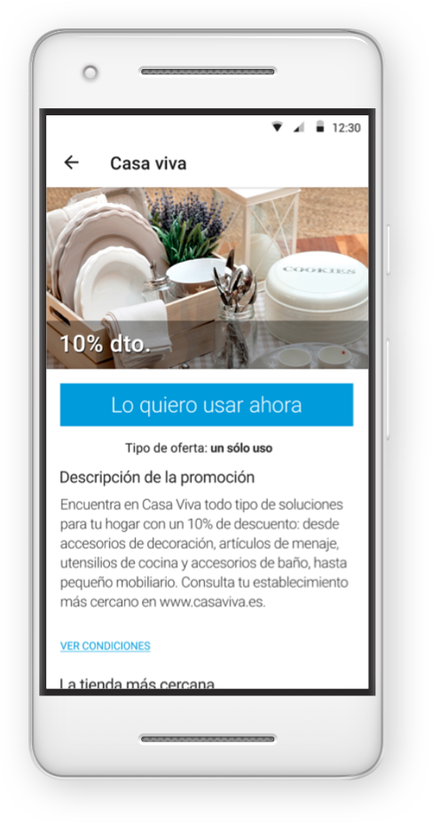
La caixa mock-up
CaixaBank Family
CaixaBank has been always famous as one of the Spanish banks that offers more rewards and loyalty points to their clients. With this app all the clients can obtain their rewards or discounts directly in specialized shops or cultural attractions.
Client
CaixaBank
Year
2017
Roles
UI Designer | Visual Designer
About CaixaBank Family
CaixaBank is one of the banks with more costumers in Spain. Because of this, they put a lot of effort to reward their clients with loyalty points that that can be exchange for physical products or cultural attraction discounts. This discounts now are easier to use than ever with their new app.
The challenge
The goal of this app is to bring an easy solution for the clients to use their loyalty points. For that a rework in the possible technologies that can be used in the shops or cultural places to redeem the coupons and discounts was needed.
In this case it was also necessary to adapt the bank branding to this new app and the brandings of the different partners.
The team
This project was developed in an Agile approach with a cross-functional team created inside Worldline Iberia. Focusing on the design there where a UX Designer (Joan Carles Cardell) and two UI Designers (Carles Salas and Marc Alcobé) involved inside the process.
My role
Because of having some parallel projects at the same time the design team decision was to split roles between UX and UI. In this case the role that I took together with a colleague was focused on the UI Design of the app and the creation of visual elements for it.
Design and research tools
Sketch
InVision
Photoshop
Illustrator
InDesign
Premiere
Design process
As the UX part was already defined the process in this case started with the UI Design:
UI Research
With the wireframes on the table and the whole UX research done the first step was to see how the client is using their corporative branding and how this can be applied to the app.
The client decided to use Android Material Design as a base to reduce costs, so there was also a research on the best components to use.
User Interface
Having Material Design as a reference and CaixaBank branding it was the moment to start designing the mock-ups from the already approved wireframes.
Prototyping
With all the mock-ups done the next step was to create a prototype for the client to showcase and give feedback and also to deliver it to the developers. For that InVision was the tool selected for the easy communication between all the parts involved in the process.
Feedback session
With the InVision prototype created it was the moment to present the app to the client and get the final approval. In this case the presentation was at the clients headquarters with a final feedback session where the last approval was given.
Delivery
Working in an Agile method the implementation of the code was already done on going and some of the already approved screens where finalized. But with the last feedback session and a final version of the InVision prototype and the measurements and the exportable assets selected the developers where ready to finalize the app.
Afterwards a last iteration with design approval was done to ensure that the design and the app looked exactly the same.